
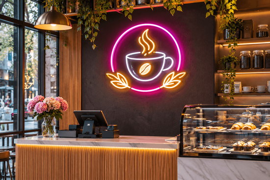
A well-chosen neon sign can express your personality, reinforce a brand, welcome customers, or give a room a memorable focal point. The key is choosing a design that belongs in its setting. From wording and color to size and placement, a few considered decisions help custom Customizable Neon Signs look intentional and feel right for years.
Start With the Purpose of the Sign
Before browsing fonts or colors, decide what you want the sign to achieve. At home, it might add character to a games room, sit above a bed, or personalize a kitchen corner. In a business, it could display a logo, highlight a service, welcome visitors, or create a photo spot.
Purpose guides the design. A short phrase can bring warmth to a living space, while a business may need a logo or concise message people can understand quickly. Write down the sign’s main job to avoid choosing something attractive online but impractical in the actual space.
Match the Design to Your Existing Style

Think of the sign as part of the room’s overall design. In a minimalist home, clean lettering, a simple outline, and one restrained color can complement the uncluttered look. A colorful entertainment room may suit playful typography or a graphic shape. Rustic interiors can benefit from warm tones and handwritten-style lettering, while contemporary spaces often pair well with crisp lines.
The same principle applies to commercial settings. A boutique, café, salon, studio, or bar each has its own atmosphere and audience. A refined script may suit a beauty business, whereas bold block lettering could be more effective in a gym or gaming venue. Look at your furniture, finishes, wall colors, signage, and brand identity before settling on a style.
A custom design neon signs concept should connect with its environment. Use contrast when you want it to stand out, or repeat an existing color or shape when it should blend in. For a different finish, personalised metal signs can complement neon lettering on feature walls, reception areas, and branded displays.
Choose Words, Fonts, and Graphics Carefully
The message is often the most noticeable part of a sign, so keep it clear. Short phrases, names, initials, and uncomplicated logos are usually easier to read from a distance than long sentences. Consider where people will view it: visitors passing a storefront need instant clarity, while someone sitting in a home lounge can take time to appreciate a more detailed design.
Font choice affects both personality and legibility. Script fonts can feel friendly or elegant, but very fine strokes may be harder to see across a large room. Sans-serif and block fonts tend to look modern and direct. If you are reproducing a logo, use a high-quality reference file and check that small details will remain recognizable when converted into illuminated tubing.
Graphics can make a sign distinctive, but avoid crowding it. One clear icon or outline is often more effective than competing elements. Review spelling, spacing, proportions, and balance in the proof before approving production.
Select Colors That Work with the Space
Color changes the mood of a room and the way a message is perceived. Warm white, amber, and soft pink can create a relaxed or welcoming feeling. Blue and cool white may feel crisp and contemporary, while brighter shades can add energy to a social or retail environment. There is no universal best color; the right option depends on the atmosphere you want.
Check the wall color and surrounding lighting. A shade that stands out against a dark wall may disappear against a bright or patterned surface. Businesses should also consider brand consistency: using an established palette helps the sign feel like part of the customer experience.
Get the Size and Placement Right
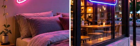
Measure the wall or installation area before choosing dimensions. Include nearby furniture, doors, shelving, windows, and other visual features in your measurements. A sign that is too small can disappear in a large space; one that is too large can overwhelm the room or compete with important displays.
Think about viewing distance and sightlines. A sign behind a reception desk should be visible to arriving visitors, while a home sign may be positioned for people entering the room or sitting nearby. For storefronts, check visibility from the pavement and consider whether architectural features could obstruct the message.
Understand the Benefits of LED Neon
Traditional glass neon and modern LED alternatives are not the same technology. Many buyers now choose custom led neon signs because LED-based designs can offer a lightweight construction, flexible design possibilities, and lower power consumption than traditional glass neon. They are also generally less fragile than glass tubing, which can make them practical for many indoor decorative applications.
When comparing options, ask about materials, backing, power requirements, and whether a dimmer or remote control is available. Check specifications rather than assuming every sign has the same features. For outdoor or damp locations, confirm that the product rating and installation instructions suit the environment; an indoor sign should not be assumed weatherproof.
Plan Installation and Safety
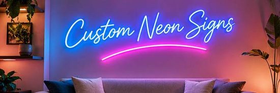
A good design also needs a sensible installation plan. Confirm how the sign will be mounted, whether mounting hardware is included, and whether the wall can support it. Keep the power supply accessible and follow the manufacturer’s guidance about ventilation, electrical connections, and cleaning. For larger or more complex installations, a qualified installer can help ensure the sign is securely fitted.
Choose a Supplier and Review the Proof
Look for a supplier that explains its customization process and provides clear details about materials, dimensions, power, lead times, and warranty coverage. Customer photos and reviews can show how finished products look beyond studio images.
Before ordering, check the proof for wording, font, colors, size, backing, cable position, and mounting method. Confirm the agreed details in writing. Business buyers should also ensure the design follows brand guidelines and suits the intended location.
Make the Sign Feel Like Yours
The best sign is not necessarily the brightest or most elaborate. It is the one that fits the space, communicates clearly, and supports the experience you want people to have. Compare proportions, colors, and placement before deciding.
When you are ready to explore options, browse custom neon signs and consider how a personalized design could complement your home or business. With a clear purpose, thoughtful styling, and careful attention to practical details, a neon sign can become a distinctive feature that feels genuinely part of its surroundings.